





Important: Do not use dots (.) in your username. Allowed characters: letters (a–z, A–Z), numbers (0–9), hyphen (-) and underscore (_)
 2 days
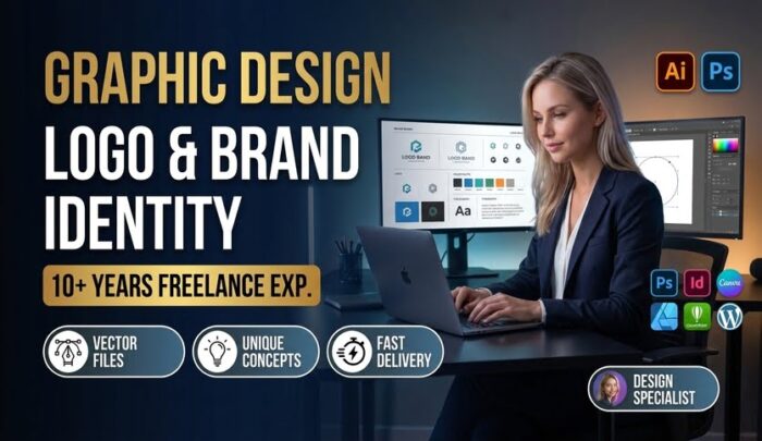
A logo has to work at 16 pixels on a favicon and at billboard scale on a storefront. Most fail because they are either too literal and dated within a year, or decorative with no structural logic behind the shapes. I design logos and brand identity systems using grid-based construction, typographic hierarchy, negative space, and color theory suited to the industry, backed by 10+ years of freelancing experience in design.
Included: competitor and category review, 2-3 distinct concept directions (wordmark, lettermark, or symbol-based, not color variants of one idea), refinement through grid alignment and scalability testing from favicon to signage size, full color and monochrome versions, final files in AI, EPS, SVG, PDF, and PNG, a brand guideline sheet covering clear space, minimum size, and approved color codes, and full ownership transfer on delivery.
Revisions are scoped at the concept stage so feedback shapes the direction early, not after a full build.
Send the business name, industry, and any brand references you like or want to avoid, and a concept direction will be scoped before work begins.

Seller
Not rated yet
From
Pakistan
Last Seen
19hrs ago
Member Since
March 6, 2025
Make Money Sharing Zeerk With Your Friends